Invenda
Vending Experience 2.0
Creating a better, more user centered vending experience.

Company
Invenda Group
Role
Product Design

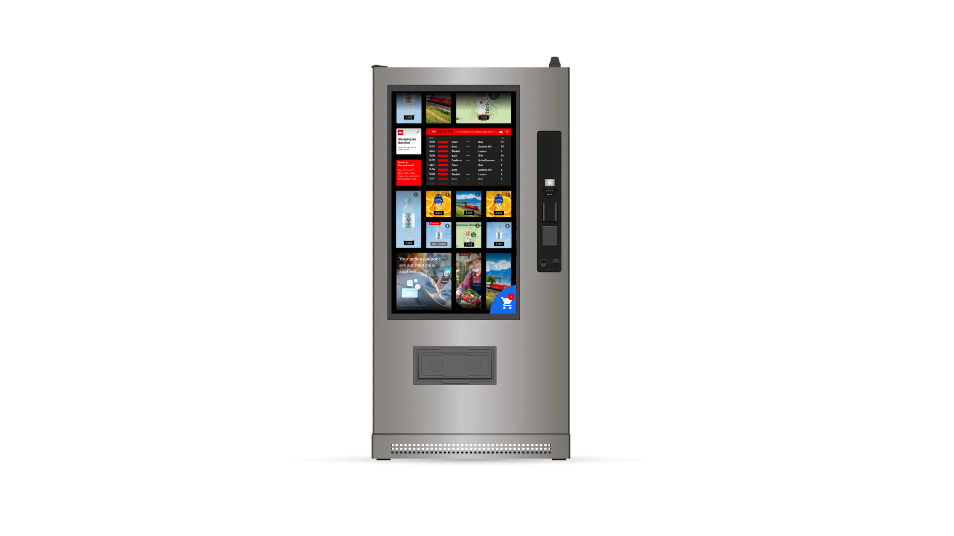
Old experience
I was tasked with modernising the company's vending machine experience. The goal was to enhance usability, make the interface more appealing, and ultimately increase user interactions and sales through the platform. My role was to lead the redesign effort, addressing the challenges of outdated UI and ineffective workflows.
Problem Definition and Initial Challenges
The existing vending machines had several critical issues. The UI was outdated and cumbersome, making it difficult for users to navigate and find what they needed. This resulted in user frustration and hindered their ability to quickly grasp product availability. Additionally, the workflows within the interface were inefficient, namely the shopping cart, further complicating the user experience. Another challenge was the difficulty in gathering qualitative feedback directly from users through the vending machines, which made it hard to identify specific pain points and areas for improvement.
The assumptions was that that these issues decreased user satisfaction and had a negative impact on sales, highlighting the need for a comprehensive redesign and overall more appealing experience in line with the recent rebranding of the company.
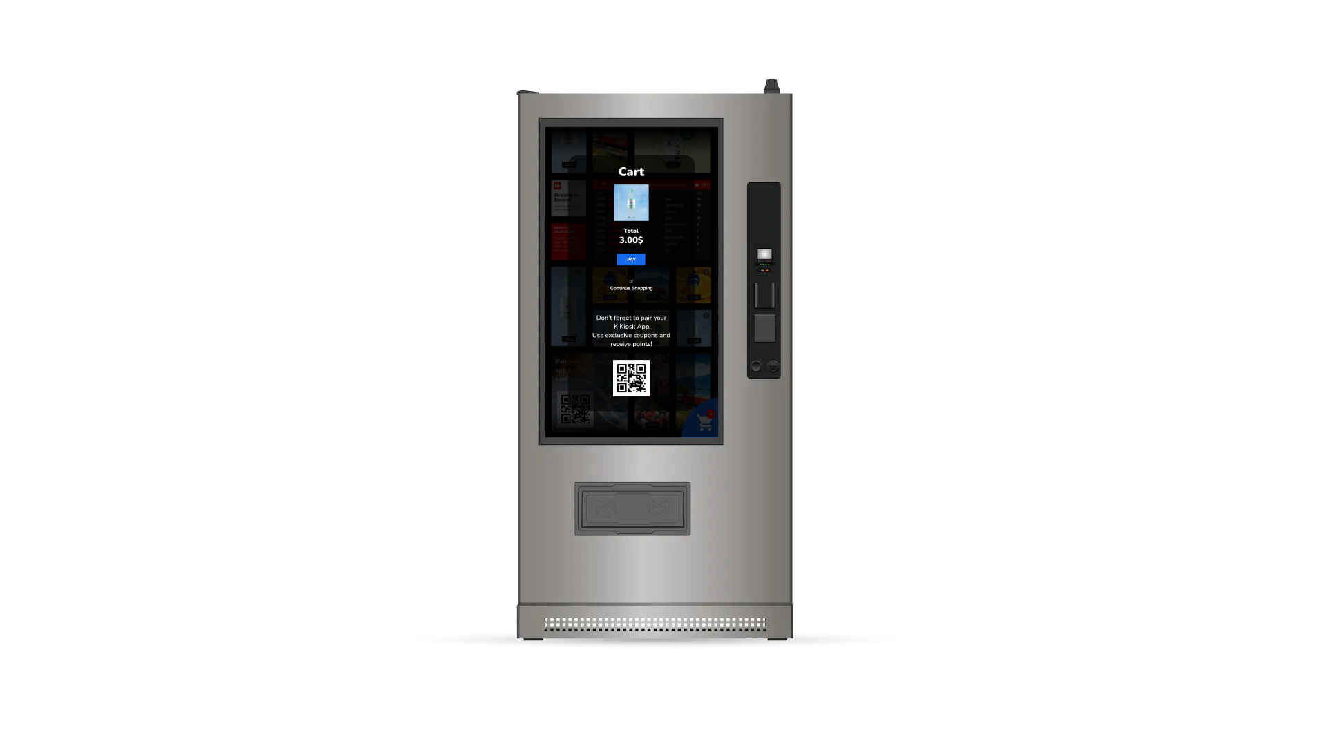
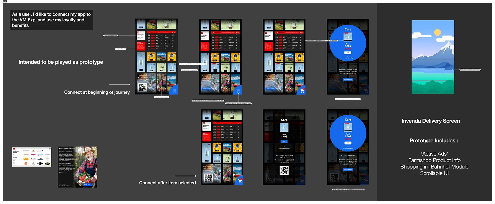
Prototyping
I created a prototype based on our user feedback (and backlog) and using Figma and some mild wizardry, we were able to simulate and prototype the experience in realtime.
Testing the Redesign
We spoke to real users in public space where the vending machines were located. We tested the old UI, gathering insights into their frustrations and difficulties. Following this, we introduced the new UI and experience, allowing us to directly compare user reactions and gather feedback on the improvements.
The insights we gained from these sessions were invaluable. Users provided critical feedback that informed our design decisions (namely improving the ‘adding to basket’ and checkout flow ), helping us refine interactions, features, and the hierarchy of elements within the interface. This iterative process allowed us to adjust the design in real-time, ensuring that it was both user-friendly and aligned with our goals.
Design Development and Refinement
With the initial feedback integrated, we moved on to maturing the design. We developed a high-fidelity prototype using Figma, aiming to create a mockup that was as close to the real experience as possible. This prototype underwent further rounds of testing, allowing us to fine-tune the design based on additional user feedback.
This phase of the project was crucial in bridging the gap between our initial concepts and the final design. By continuously testing and refining the prototype, we ensured that the design not only looked good but also functioned effectively in real-world scenarios.
Moving Forward
The redesigned vending experience is currently in development. To evaluate its success, we plan to conduct further A/B testing, comparing the new experience with the old one. This will allow us to measure improvements in both sales and user satisfaction. Additionally, we plan to gather further feedback through optional surveys, where customers can share their experiences. As part of the mobile integration, we will also ask users to rate and review their experience, providing us with valuable insights into the effectiveness of the new design.
We anticipate that the redesigned interface will significantly improve usability, making it easier for users to navigate and interact with the vending machines. By streamlining the workflows and creating a more intuitive user experience, we expect to see an increase in user interactions and, ultimately, a boost in sales. The goal is to not only meet but exceed user expectations, providing a vending experience that is both modern and efficient.